
Better Graphics on R
Published:
The idea of this course is to introduce several cool graphics over different packages and how to build it step-by-step. Hopefully you will get some tools to run away from the basic R graphics.
Graphics
The idea of this course is to introduce several cool graphics over different packages and how to build it step-by-step. Hopefully you will get some tools to run away from the basic R graphics.
Correlation plot
corrplot is a library used to make better and beautified graphics. To install it just install.packages("corrplot"). We here present some examples of graphics.
Let’s make up some data. Simulating 6 variables from a normal distribution with different means and variance, they are somewhat related.
library(corrplot)
A <- rnorm(50,10,6)
B <- -(A-rnorm(50,10,2))
C <- B+rnorm(50,2,3)
D <- -(C+rnorm(50,1,3))
E <- D+rnorm(50,3,5)
F <- rnorm(50,10,10)
data <- cbind(A,B,C,D,E,F)
#Getting the correlation matrix
cor.matrix <- cor(data)
#Changind the method
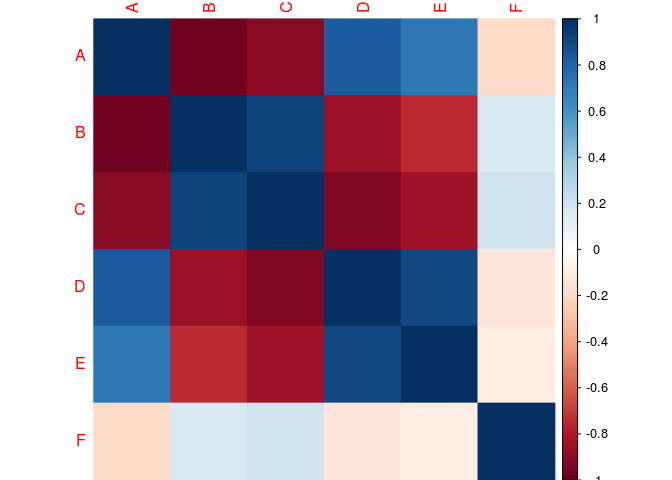
corrplot(cor.matrix,
method="color")
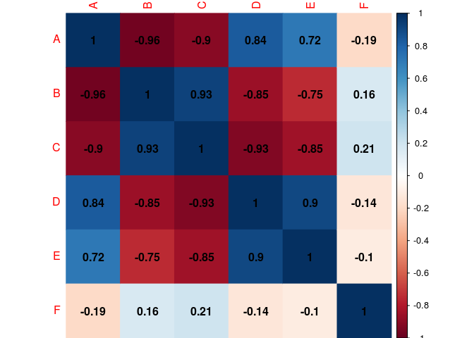
#Corr value inside the cell (black for the color of the coef.)
corrplot(cor.matrix,
         method="color",
         addCoef.col="black")
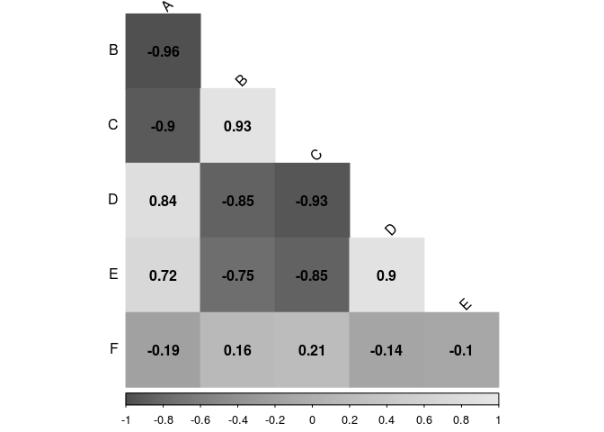
#Correlation matrix are simetric, so we just need the lower-tri part.
corrplot(cor.matrix,
         type="lower",
         method="color",
         ddCoef.col="black")

## Warning in text.default(pos.xlabel[, 1], pos.xlabel[, 2], newcolnames, srt
## = tl.srt, : "ddCoef.col" is not a graphical parameter

## Warning in text.default(pos.ylabel[, 1], pos.ylabel[, 2], newrownames, col
## = tl.col, : "ddCoef.col" is not a graphical parameter

## Warning in title(title, ...): "ddCoef.col" is not a graphical parameter

#Removing the diagonal
corrplot(cor.matrix,
         type="lower",
         method="color",
         addCoef.col="black",
         diag=FALSE)

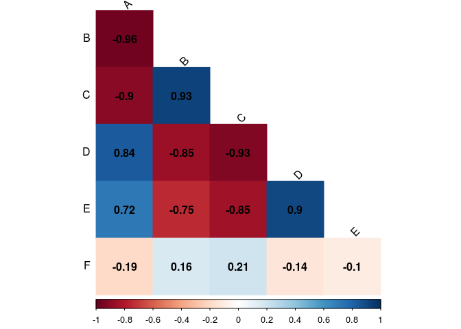
#Letting black the factors name
corrplot(cor.matrix,
         type="lower",
         method="color",
         addCoef.col="black",
         diag=FALSE,
         tl.col="black")

#Sloping superior axis
corrplot(cor.matrix,
         type="lower",
         method="color",
         addCoef.col="black",
         diag=FALSE,
         tl.srt=45,
         tl.col="black")
Changing the colors
To change the colors of a plot, first you need to specify a palette of color. R already have some built in palettes as rainbow, heat.colors, terrain.colors, topo.colors, cm. You can find more about them here or typing ?rainbow. We chose the heat.colors palette. To use it, you need to call the name of the palettes as a function and the argument is how many n colors of this palette do you want. Try change it to see what is going on. This function returns a vector of n length with colors on hexadecimal notation. An example:
corrplot(cor.matrix,
         type="lower",
         method="color",
         addCoef.col="black",
         diag=FALSE,
         tl.col="black",
         tl.srt=45,
         col=heat.colors(100))
Change the value of heat.colors and play around with the others palettes.
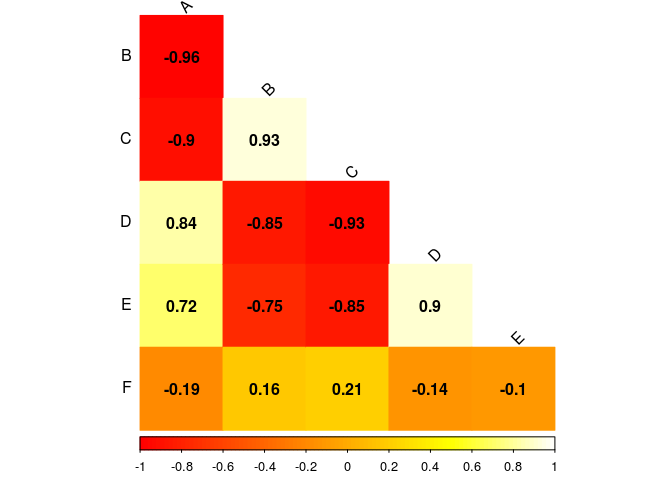
Setting your own palette
To set your own palette you can use the function colorRampPalette, as argument you sort all the colors you want to use, you can use hexadecimal or call the name of the color. The last one does not work for every color! If you want to make a palette going from yellow to brown:
myPalette <- colorRampPalette(c("yellow","orange","brown"))

corrplot(cor.matrix,
         type="lower",
         method="color",
         addCoef.col="black",
         diag=FALSE,
         tl.col="black",
         tl.srt=45,
         col=myPalette(100))

An example: I want to make a palette using the colors of my University logo to match with my presentation layoult:
![]()
- Get an image/logo;
- Upload it here or use the Color Picker on MS Paint or any other software;
- Get the hexadecimal colors code;
- Make your palette;
myPalette <- colorRampPalette(c("#05493C","#3C725B","#3C9F69","#A6D6C8"))

corrplot(cor.matrix,
         type="lower",
         method="color",
         addCoef.col="black",
         diag=FALSE,
         tl.col="black",
         tl.srt=45,
         col=myPalette(100))

Now on grayscale, sometimes you want to print in a cheaper way (or the journal is asking for it).
corrplot(cor.matrix,
         type="lower",
         method="color",
         addCoef.col="black",
         diag=FALSE,
         tl.col="black",
         tl.srt=45,
         col=gray.colors(100))
ggplot2
We based this section on this presentation. The ggplot2 graphic function has 5 components:
- Data
- Geometric object (geom)
- Statistical transformation (stat)
- Scales
- Coordinate system
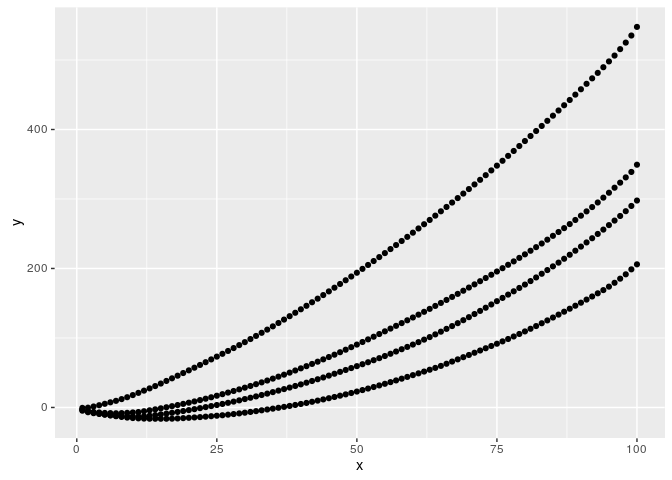
To start, our data has to be in a data frame format where each column will be an dimension (axis) in our graphic. Let’s make up a data frame.
library(ggplot2)

n <- 100

y1 <- cumsum(sort(rnorm(n,2,2)))
y2 <- cumsum(sort(rnorm(n,3,2)))
y3 <- cumsum(sort(rnorm(n,4,2)))
y4 <- cumsum(sort(rnorm(n,5,2)))

x1 <- x2 <-x3 <- x4 <-c(1:n)

w1 <- rep("A",n)
w2<- rep("B",n)
w3 <- rep("C",n)
w4 <- rep("D",n)

df<-data.frame(x=c(x1,x2,x3,x4),
               y=c(y1,y2,y3,y4),
               w=c(w1,w2,w3,w4))

#Creating our plot area
graphic<-ggplot(df,aes(x,y))

#Plotting our points
graphic + geom_point()
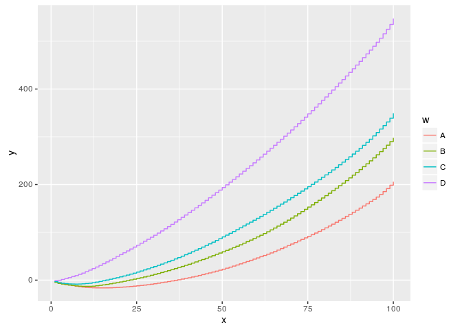
#Plotting by 'w'
graphic + geom_point(aes(colour = w))

#Plotting step by step
graphic + geom_step(aes(colour = w))
#Plotting step by step
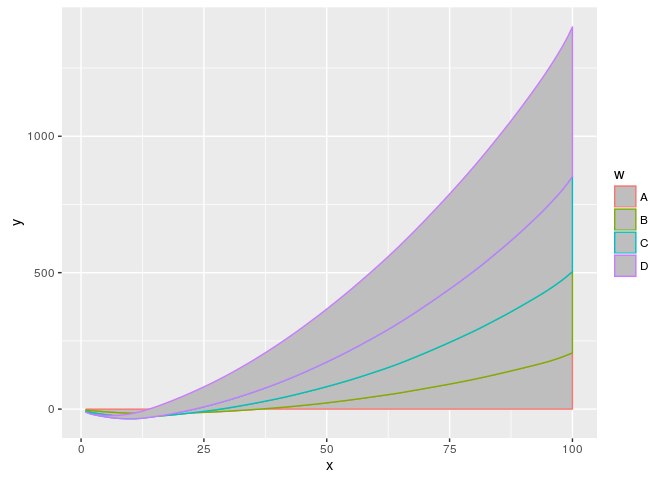
graphic + geom_area(aes(colour = w))
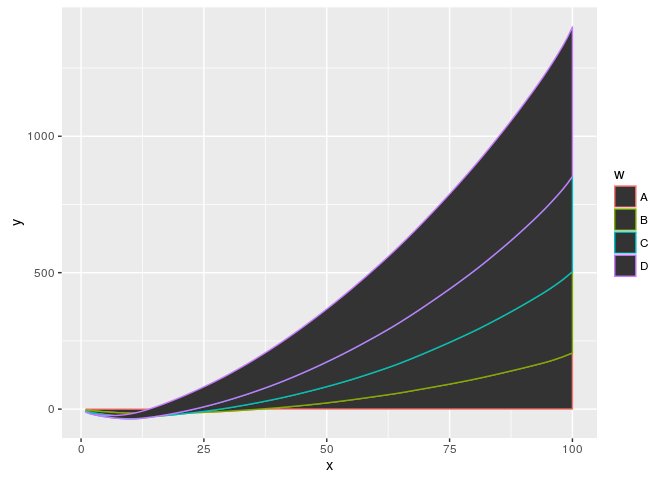
graphic + geom_area(aes(colour = w),fill="gray")
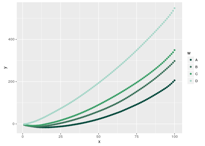
#Changing the colour palette
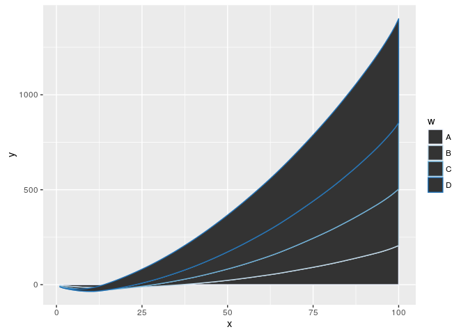
graphic + geom_point(aes(colour = w)) + scale_colour_brewer()

graphic + geom_area(aes(colour = w)) + scale_colour_brewer()
#Changing the colour palette
myPalette <- c("#05493C","#3C725B","#3C9F69","#A6D6C8")
graphic + geom_point(aes(colour = w)) + scale_colour_manual(values=myPalette)
Field Plot with ggplot2
Here we present a tool to graphically analyze field experiments. The following scripts were developed for field crops.
First, let’s make up some Height data in a 20x10 field. As we are working with ggplot2 we have to had a data frame with this data.
height <- rnorm(200,25,5)
row <- sort(rep(1:10,20))
col <- rep(1:20,10)

df <- data.frame(row=row,
                 col=col,
                 heigth=height)
With our data frame, let’s plot.
#A first area plot
field.plot <- ggplot(df, aes(x=row, y=col, color=height))
field.plot +
  geom_point()
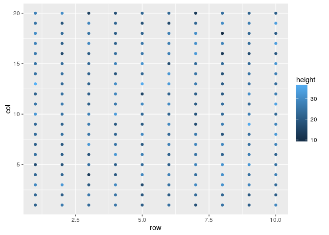
#Changing the colors
field.plot +
  geom_point() +
  scale_colour_gradientn(colours=heat.colors(100))
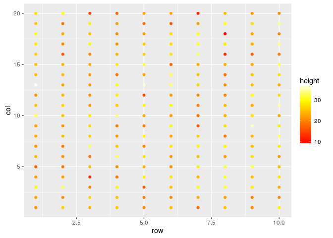
#Changing the point size
field.plot +
  geom_point(size=4) +
  scale_colour_gradientn(colours=heat.colors(100))
#Rescaling the axis, supposing experimental units
field.plot +
  geom_point(size=4) +
  scale_colour_gradientn(colours=heat.colors(100)) +
  coord_fixed(ratio=1)

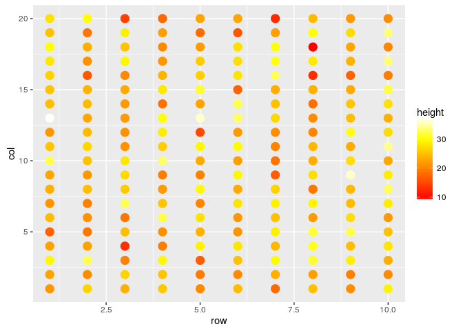
#Changing the axis thicks
field.plot +
  geom_point(size=4) +
  scale_colour_gradientn(colours=heat.colors(100)) +
  coord_fixed(ratio=1) +
  scale_y_continuous(breaks=1:20) +
  scale_x_continuous(breaks=1:10)
 With this last graphic we already can have a nice idea of our field data dispersion. If you are working with a forage or a grain crop, probably a raster graphic is better for you:
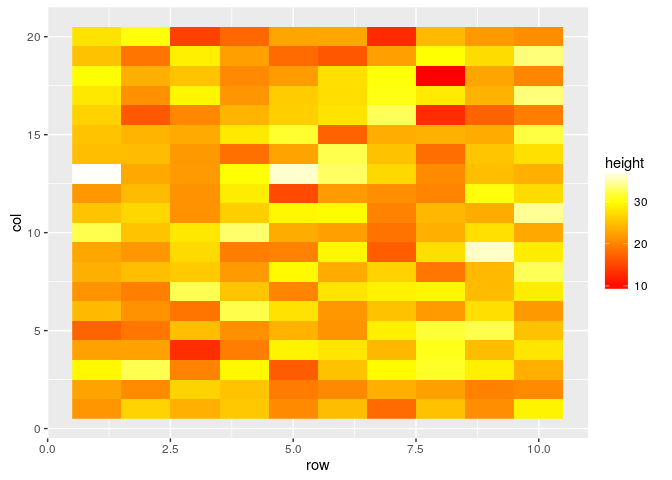
#Plotting as raster
field.plot <- ggplot(df, aes(x=row, y=col, fill=height))
field.plot +
  geom_raster()  +
  scale_fill_gradientn(colours=heat.colors(100))
#Plotting as interpolated raster
field.plot +
  geom_raster(interpolate = TRUE)  +
  scale_fill_gradientn(colours=heat.colors(100))

#Changing the axis thicks
field.plot +
  geom_raster(interpolate = TRUE)  +
  scale_fill_gradientn(colours=heat.colors(100)) +
  coord_fixed(ratio=1) +
  scale_y_continuous(breaks=1:20) +
  scale_x_continuous(breaks=1:10)

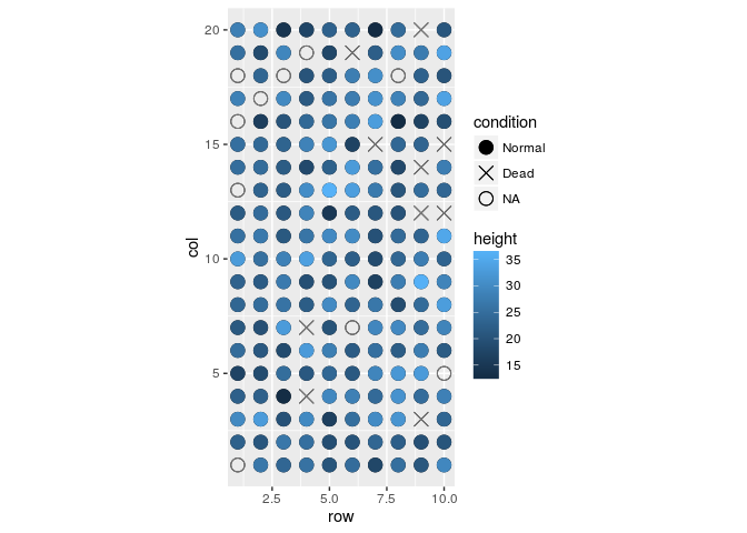
As we know, it is rare an experiment with data for every experimental unit. In the following we present how to include a 4th dimension on your plot, this new dimension will have a qualitative information: collected data, missing data, and dead individuals.
#Let's suppose you have some NA and some death data, let's increase 1 more dimension in your data
#Some conditions
aleatory.condition <- sample(1:200,20)
death <- aleatory.condition[1:10]
missing.data <- aleatory.condition[11:20]

height[aleatory.condition] <- NA
condition <- rep(0,200)
condition[death] <- 1
condition[missing.data] <- 9

#Now our data frame has 1 more dimension
df <- data.frame(row=row,
                 col=col,
                 heigth=height,
                 condition=as.factor(condition))

field.plot <- ggplot(df, aes(x = row, y = col, shape = condition))

field.plot +
  geom_point()
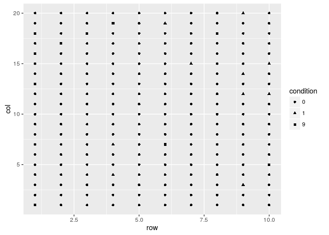
field.plot +
  geom_point(size=4)
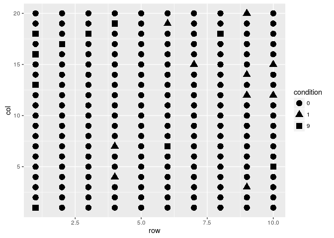
field.plot +
  geom_point(size=4) +
  scale_shape_manual(values=c(19,3,1),labels=c("Normal","Dead","NA"))
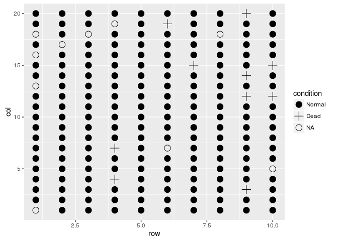
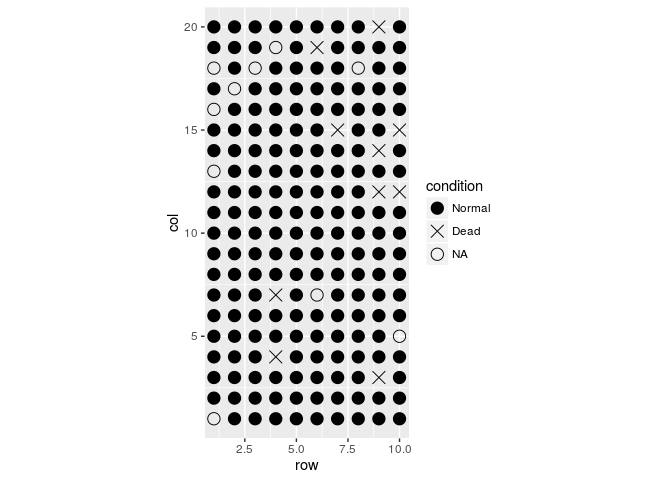
field.plot +
  geom_point(size=4) +
  scale_shape_manual(values=c(19,4,1),labels=c("Normal","Dead","NA")) +
  coord_fixed(ratio = 1)
#Plotando gradiente de cores
field.plot +
  geom_point(size=4) +
  scale_shape_manual(values=c(19,4,1),labels=c("Normal","Dead","NA")) +
  coord_fixed(ratio = 1) +
  geom_point(aes(x = row, y = col, colour = height), size=4)

field.plot +
  geom_point(size=4) +
  scale_shape_manual(values=c(19,4,1),labels=c("Normal","Dead","NA")) +
  coord_fixed(ratio = 1) +
  geom_point(aes(x = row, y = col, colour = height), size=4)
field.plot +
  geom_point(size=4) +
  scale_shape_manual(values=c(19,4,1),labels=c("Normal","Dead","NA")) +
  coord_fixed(ratio = 1) +
  geom_point(aes(x = row, y = col, colour = height), size=4) +
  scale_colour_gradientn(colours=heat.colors(100))
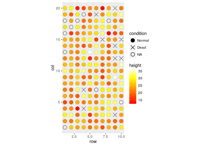
field.plot +
  geom_point(size=4) +
  scale_shape_manual(values=c(19,4,1),labels=c("Normal","Dead","NA")) +
  coord_fixed(ratio = 1) +
  geom_point(aes(x = row, y = col, colour = height), size=4) +
  scale_colour_gradientn(colours=heat.colors(100)) +
  scale_y_continuous(breaks=1:20) +
  scale_x_continuous(breaks=1:10)
ggplot2 as drawing tool
shiny
About it
We are currently writing this course, if you find any mistake (including misspelling ones) or want to add something else please drop us an email at rramadeu at gmail dot com. This material has been written using RMarkdown.
Good luck! Remember, we are here to help!